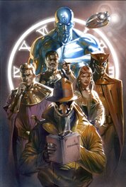
In comixfan 's collection
Comment
2024 started off with a Little Nemo Sunday and now 2025 starts off with a Watchmen page. Two opposite ends of the comic art royalty spectrum yet perhaps more in common than one might think at first. Perhaps I'll get to that in a moment. For those in the TLDR crowd, no worries, I don't blame you but for those of you that want to read more, sit back and lets see where what I have to say goes.
A Watchmen page is one of those things I'd always wanted but didn't want bad enough to pay enough to get one. When they were $4-5k, I didn't want to pay more than $3k for one. When they were $7-9k I didn't want to pay more than $5-6K for them and so I was always a day late and a penny short. The ship was leaving without me. I'd pretty much given up hope of getting on but then this page was offered up. It was more than I wanted to spend still but this time I said I'd take the plunge paying more than I wanted to have a ticket to ride on that ship after all. Perhaps it is the Black Freighter I bought a voyage on. So now I am on board.
Before I talk about the page, I have a secret to confess. I don't really like the Watchmen comic. I never did. I bought a leather bound copy of it shortly after the original print run and read it. I have read it in total 4 times including around the time the movie came out. I find it a tedious read. It is long, disinteresting and a struggle to get through. I like a lot of Alan Moore's other books like V, From Hell, Swamp Thing and Halo Jones (my favorite) but Watchmen, not so much. I think the concept and some of the scenes are really cool but the rest doesn't work for me. That is probably why I didn't pursue it further all these years and pay up when I should have. What I wouldn't give to be back in the day when the pages were $5k again. So here I am paying way to much for a page from a book I don't even like. WTF!
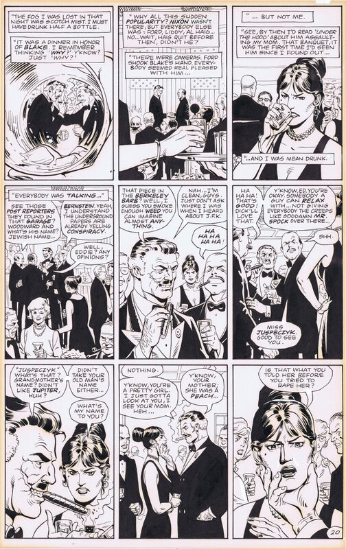
What I have come to appreciate from Watchmen is the art and design that was put into the book. For me, this is what elevates the book and drove my desire to own an example. The simple 9 panel grid used to great effect. The visual queues and clues. The use of imagery and motifs. As much as I don't like reading the book, I do like flipping through and looking at some of the sequences and pages.
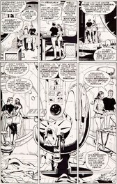
So here is a solid page without any costumes on it but a key scene and with features that I like. I'm sure there are many out there with a much deeper insight into this than I have but I'll share what I see. The mirroring and repetition of images. The first and last panel are similar with the glass in the hand and then with Laurie's face in the hand in a similar design. The use of circles and spheres are throughout the book with everything from the watchmen pin(first and last panel of book and appears 3 times on this page), radiation hazard signs, gears, the circle on Dr. Manhattan's forehead, the clock, snow globe, Vitruvian man images, Night Owl's goggles/ship, the bubble around Silk Spectre on the moon, radar screen...if you look you could go on for sometime and these elements make it onto the covers too. Nothing is random with Alan Moore. That first image with the distorsion looking through the glass is another element used well with either distorted images or reflected images used in storytelling. You could equate some of this with the idea behind the Rorschach test. Like a large tic-tac-toe game the diagonals are interesting sequences. The diagonal from the first, fifth and 9th panel have that round central image like an O won game. The third, fifth and seventh panel diagonal have a changing in perspective of the Comedian and Laurie apart and then together. The remaining 4 panels are of The party and alternate with these more important panels both storytelling wise and visually. None of this is accidental. You will see similar page designs and nuances if you look for them throughout the book.
From a content point of view, this is a key scene in the story with the Laurie confronting the Comedian about the assault of her mother. A MeToo event about 30 years too early. This is also the moment you might realize that Laurie might have a Luke Skywalker moment in her future with the revelation that the object of hate is indeed her father.
A lot could be said about Gibbons art on this book. I like his art in general but he was never one of those artists who had a real standout and unique style. Dave did a really good job of taking the instruction he got from Alan Moore (which are notorious for being very in depth,long, detailed and fastidious) and bringing them to the page faithfully. Not such an easy task and I'd imagine this is the most faithful any artist has been to Moore's prose.
Although I have a lot more to write I think I've gone on long enough. I'd planned on talking about the physical original art itself, Moore's writing and I wanted to tie it back in with the Little Nemo I mentioned at the beginning. I'll write about it in the CFA-APA instead.
7 comments
To leave a comment on that piece, please log in
About Dave Gibbons
David Chester "Dave" Gibbons is an English comic book artist, writer and sometimes letterer. He is best known for his collaborations with writer Alan Moore, which include the miniseries Watchmen and the Superman story "For the Man Who Has Everything". He was an artist for the UK anthology 2000 AD, for which he contributed a large body of work from its first issue in 1977.

