In RichardHaddon 's collection
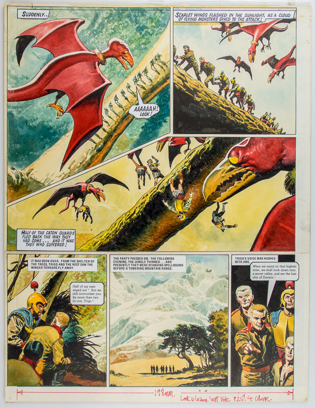
The RISE and FALL of the TRIGAN EMPIRE - The Lost City / De verboden stad (Dutch title)
Watercolor
Ecoline combined with Gouache
36 x 46 cm (14.17 x 18.11 in.)
Ca.
Added on 6/8/26
Link copied to clipboard!
Description
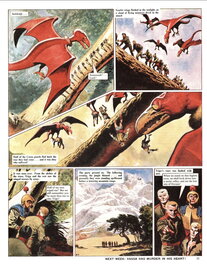
Page 10 - Episode 16 of The RISE and FALL of the TRIGAN EMPIRE
The Lost City (The Collection)
De verboden stad (Dutch title)
Illustrated by Don Lawrence en Written by Mike Butterworth
Originally published in issues 371 (22 Februari 1969) until 382 (10 May 1975) of Look and Learn magazine.
It is reprinted in Volume 3 of The Trigan Empire—The Collection (the Don Lawrence Collection).
It is reprinted in Volume 2 of The Trigan Empire (Rebellion).
The Lost City (The Collection)
De verboden stad (Dutch title)
Illustrated by Don Lawrence en Written by Mike Butterworth
Originally published in issues 371 (22 Februari 1969) until 382 (10 May 1975) of Look and Learn magazine.
It is reprinted in Volume 3 of The Trigan Empire—The Collection (the Don Lawrence Collection).
It is reprinted in Volume 2 of The Trigan Empire (Rebellion).
Inscriptions
no signature
Comment
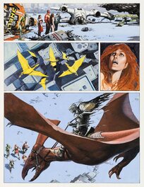
Look at these “Red Dragons”!
In fact they are more like pre-historic birds/reptiles.
The sequence, colours, dramatic camera angles and hopeless victims result in an almost cinematic experience.
However Don Lawrence (looking back in 1998) said;
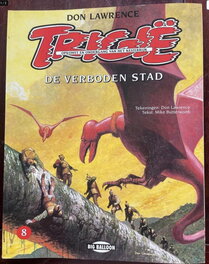
“I don't like the bottom picture from the sequence of three, the mouth of the bird looks like part of the tree trunk. They flow almost seamlessly into each other. But the drawings do have more dynamics, because of the contrast in the light and dark colours, especially because of the dark underside of the wings.”
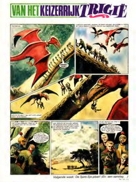
“The tree trunk on the new cover is well drawn.
Especially in its details it is better than in the story, like that green, seaweed-like stuff, that looks good.
I am also pleased with the air, but less satisfied with the birds: they should have been much darker under the wings, just like in the story. They don't radiate aggression, they are not really threatening. It would have been better if I had had one of those soldiers take in the mouth.
The album typography does work with this illustration. The drawing actually needs these.”
(taken from “TRIGIE - DE WERELDEN VAN DON LAWRENCE, Big Balloon B.V. 1998)
Notice the text size and font type in the original artwork differ from the “Look and Learn” page.
Someone has been messing with the text blocks in the upper three pictures, this is especially ‘hurting’ the second picture.
In fact they are more like pre-historic birds/reptiles.
The sequence, colours, dramatic camera angles and hopeless victims result in an almost cinematic experience.
However Don Lawrence (looking back in 1998) said;
“I don't like the bottom picture from the sequence of three, the mouth of the bird looks like part of the tree trunk. They flow almost seamlessly into each other. But the drawings do have more dynamics, because of the contrast in the light and dark colours, especially because of the dark underside of the wings.”
“The tree trunk on the new cover is well drawn.
Especially in its details it is better than in the story, like that green, seaweed-like stuff, that looks good.
I am also pleased with the air, but less satisfied with the birds: they should have been much darker under the wings, just like in the story. They don't radiate aggression, they are not really threatening. It would have been better if I had had one of those soldiers take in the mouth.
The album typography does work with this illustration. The drawing actually needs these.”
(taken from “TRIGIE - DE WERELDEN VAN DON LAWRENCE, Big Balloon B.V. 1998)
Notice the text size and font type in the original artwork differ from the “Look and Learn” page.
Someone has been messing with the text blocks in the upper three pictures, this is especially ‘hurting’ the second picture.
Publication
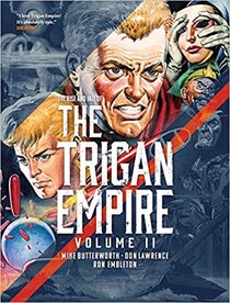
- Intégrale n° 2
- Rebellion
- 01/2021
- Interior page
-
2 comments
To leave a comment on that piece, please log in
About Don Lawrence
Donald Southam Lawrence was a British comic book artist and author. Lawrence is best known for his comic strips The Rise and Fall of the Trigan Empire in the British weeklies Ranger and Look and Learn and the Storm series, first published in the Dutch weekly Eppo.
![[The Trigan Empire #20] The Invisibility Ray ( a.k.a. False Accusation)](/planches/200H/2026/93/lawrence-the-trigan-empire-20-the-invisibility-ray-a-k-a-false-accusation-31gj.jpg "[The Trigan Empire #20] The Invisibility Ray ( a.k.a. False Accusation)")